


I initially spent a few weeks looking at branding, blog themes, designs for headers (that's where the title is at the top) and fonts. Despite searching I could not find what I wanted even if I was prepared to pay for it - the colours were not right, or the image looked great, but once up, didn't look right.
After hours of searching for the right colours, themes, images and almost going mental and wanting to throttle someone out of frustration, I gave in and got the kids watercolours out to experiment.

With a little help I painted some washes of colour and some swatches.

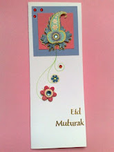
I simply took photo's of these and cropped and edited them to create my new header and elements


The swatches I used to crop and create labels like the ones below. The whole process took about half an hour from painting to cropping and resizing the image.
I really enjoyed making my own and it has really inspired me to try out other things like posters with quotes and blog design elements.
I would love any feedback on the new look and any ideas on what else could be changed or added. Your thoughts and ideas are really important to me!


MASHALLAH! It looks very nice n bright. I cant believe u did it all urself. MA!
ReplyDeleteThank you dear Sis! I have just finished a book cover too that I painted and then cropped and used for my new e-book and elements (headings) in the book. It's so much fun, defo want to try more of this.
DeleteReally lovely design! By the way I am usually at a loss understanding designs. It is just beyond me.
ReplyDeleteWhen I saw Deloitte's logo, I thought the founder wanted to save money, so he gave the task to his school-going child.
When I saw your header, I thought you have got it done by some professional designer. Alas! I am wrong again.
Thank you for your kind comment, its very encouraging. Maybe deloittes wanted to go for a simple and clear logo and used colour to get the message across (in colour psychology blue invokes trust, peace, order and loyalty). Lol at least you hope they will have put some thought into it.
Deleteif u add a logo it will look more nice
ReplyDelete